Monday, 3 May 2010

Evaluation: How did you use media technologies in the contruction and research, planning and evaluation stages

Media technologies were a very important part of the research stage more than the planning, for each of my pieces. Using the website YouTube, i was able to download and post trailers of existing films of which i was going to analyse. YouTube is a site which can be regarded as both a film makers best friend and worst enemy. Because while a film maker can generate publicity and develop an advertising campaign on YouTube for a film to create hype and expectation, YouTube can also be used to post segments of the film on their, or even the entire film in small ten minute pieces. Despite this however YouTube can also house a lot of user generated content, bringing into the ideas of we media as it can be seen on their that people have created their own short films, animations and even written their own songs which have generated millions of hits on the site.


YouTube as a website served its uses for me in the research and evaluation stages as it allowed me to obtain the trailers that i want and download them allowing me to post them on the blog with my analysis, and it allowed me to upload my final piece onto YouTube to get more audience feedback from people.

The other huge Internet factors used throughout this course was of course the blog, which was where i have posted all my items for the world to see.

Another site which proved invaluable were IMDB (Internet movies database). IMDB proved a very useful sight in finding out information about the films which i was going to analyse in the research stage and helped me choose which film trailers to look at for ideas on the conventions on the trailers. IMDB also helped me find the posters which i was going to use as my style models for my finished piece.


Media technologies which were used not involving the Internet would be programs that were used for editing, these were Adobe Premiere Pro a video editing software and GIMP a photo shop style image editing software package.


Premiere pro served to be the primary tool used in the video editing as it provided all the necessary clip selection and arrangement options i needed to take the parts of my film from the raw footage and arrange them in the order of which i wanted them to be in.


GIMP provided the means of which i needed to edit the images, it uses all the features of Adobe photo shop it allowed me to cut out the foreground and background images from my original photos and paste them together into one image featuring customized text for the film title and tag lines.


Evaluation: What have I learned from my audience feedback

Due to the lack of posting during the course i did not receive much feedback from my posts, however after putting the video up onto YouTube i have had a few comments on there about the good features of the trailer and how it could be improved for next time.


While i did not receive much feedback, what i did receive was useful in identifying the good and the bad points of my main task and ancillary texts and show how they could be improved.


The comments which i did receive were mostly from my media class and other media students in the school who provided useful input and information about how my project was shaping up and what it was going to be in their minds.


During the planning stage for my trailer i posted a list of events which i wanted to happen during the trailer, i made the list as detailed as i could including the camera angles and speed of editing which i wanted to use. One of my friends, Ronan JD Sullivan commented on this post and told me his thoughts, he said "its really clear in my head how it all would look", he also made a suggestion that i "have the characters facing each other in a split clip". While i did not get to make a split clip for my final scene, i did take his comment and used it to expand upon my ideas and come up with a shorter trailer for easy editing.


The feedback that i received after posting all the pieces onto the blog allowed me to see what i had done wrong and how i could improve it for next time, or how it could have been edited to look better. The comments told me how i could improve the spacing on the poster, and how i could have used more sound effects on the trailer such as using a build up effect before the main title music set it.


Sunday, 2 May 2010

Evaluation: How effective is the combination of the main product and the ancillary tasks


The combination of all three tasks was a very good one, they proved effective in reaching their audience of teenage viewers who need a laugh and like physical comedy. It is effective as the three tasks show consistency throughout the course.


    An example of this consistency can be seen in the typeface that i used, called Agent Orange, i found it to be quite effective at showing a funnier side to the titles, the typeface used is a very important aspect of a trailer. Whereas a horror trailer may use a font which is worn down or bloody my trailer had to use one which could be associated with comedy.

    Agent Orange is a 3D font which is can only be block filled red with the filling tool when it is used as an image, if it is coloured using the text colour it only outlines red. I was looking for one which resembled the font used in films such as "EPIC MOVIE" as that was a 3D one which looked comical. While Agent Orange did not match my needs perfectly it seemed to satisfy the one who saw it. The font was used consistently throughout the course in everything which was meant to be directly related to the films title such as the captions and titles in the trailer, the main title on the poster of "luggage boys" and the words "Luggage Boy" in the magazine front cover, or the title at the end of the trailer.


    The audience are then able to make a connection between the main title which is written in Agent Orange and anything else written in the same font as being important to the plot i.e. the titles on the trailer "thrills" "spills etc.

Obviously i have used the main characters, Alex and Nathan, in all three of the pieces. They appear as the centre head of each of the pieces.


Evaluation: In what ways does your product use or challenge forms and conventions of real media products

With everything out of the way it is now time to finish and evaluate my current job thus far.

The genre which i chose to do for this course was one which i had not seen much of in the entire A2 exemplar work which i had seen on the OCR websites for good, high marked work. The horror genre which everyone else seems to have done was not what i wanted to do, it seemed too easy to as a horror trailer is a quite simple (no offense to those who did horror) trailer to make. While a horror trailer did seem like a good idea at first i decided that i wanted a challenge, i wanted to do a comedy film.

My media product i believe uses the forms and conventions of a comedy trailer quite well, it balances the values of quick comedic gags with a small amount of back story thrown in.

With one of the trailers which i analysed, Youth in Revolt, it showed a small piece of back story narrated over to provide the audience with a clear idea of what is going on, after the initial bombshell of why the characters motivations are revealed, the background music, which suits it perfectly, kicks in and the audience are shown a series of well timed and executed comedic acts to reel them in to watch the film.
My trailer follows the same style of their trailer by providing the audience with some clips from before the motivations are revealed with some captions and titles to inform the audience of what was going on, as in Youth in Revolt, once the bombshell has been dropped the music sets in and this is followed by a series of comedic gag which do not give away much about the plot and still keeps the audience entertained, in this way do i believe that my media trailer follows the conventions of a comedy film trailer.


The music that i used in my trailer i thought challenged the conventions of a comedy trailer, quite often in trailers you will get music which relates back to the plot line itself, going back to Youth in Revolt with Bon Jovi and You Give Love a Bad Name, it relates back to the ideas of having your heart broken and doing something about it.


In my trailer, i used a piece of music which does suit the comedy genre but it is a modern take on a classical piece. The Russian Dance from Tchaikovsky's Nutcracker is a good piece of music to put fast physical comedy gags to and generally suits the comedy genre, unfortunately in modern times the classical music has gone out of fashion in trailers unless they are based in ancient wars or action films. Comedy trailers now tend to focus on music which relates back to the topic it is focusing on. I decided that my trailer would focus on the comedic gags more than the story and as such i needed to use a piece of music like the Russian Dance. Luckily i was able to find an uncopyrighted source who had remixed the song for a more modern era on the electric guitar which suited my trailer perfectly. So rather than have music which had a point, my background music was purely for comedic effect.

All three Final Pieces


While all three pieces are already on the blog i felt like it would be useful if they were all in one post together for any last minute comments

Magazine cover development and final piece

Once I had my style model for the film magazine and i knew what i was going to base my magazine off i had to use some more of the images i had captured during the filming of the trailer itself to create another photoshopped image to use on the front of my magazine.


These were the two images which would be the main building blocks of my magazine front cover. This cover would look more like a combination of both faces molded together into one, i.e. half of each of the characters faces would be put together and presented as one being on the front of the magazine despite it looking like two different people.


This would involve using the GIMP software again in order to get the cutouts of both faces and fuse them together onto the same canvas much like the last one. The image fusing process did not take very long and was very simple to do, after a few text adjustments with the font "agent orange" eventually the two became one and gave way into the image below.


This image would then be added onto a balnk publication in the program publisher and used as part of a magazine front cover, the tagline reads "there can be only one..." parodying the highlander tagline for comedic effect.


The magazine was laid out in publisher for the images and text to all be added to later on, the magazine itself would be called "FILM ROULETTE" as it suggests that it deals with all sorts of films be the the high winners such as Avatar or the low loosers such as Clash of the Titans.


After looking extensivly at many different varients of the Empire magazine i determined that the best way to lay the magazine out would be to have small section at the top for the magazines selling line, date and price. The main section would house the magazine title and main film story and then have a small bit at the bottom with 2 or 3 smaller stories to take up space. All the images used in the magazine were manipulated in some way to make them my own.


What follows is the magazine itself.


The Magazine uses the white background effectively by making use of the black and red text, with the fade in effect at the bottom from where the smaller stories are. All the smaller stories are then housed in a cartoon film reel strip in each of the frames.
Although the title of the film is Luggage Boys, the tagline says "there can be only one", therefore it is only logical there can only be one Luggage Boy. The magazine is not advertising the film directly, it is hosting an interview with the stars of the film and the fact that the two have fused into one backs up the statement "there can be only one....LUGGAGE BOY"

Film Magazine analysis


The film magazine which i am going to be analysing is an issue of the magazine Empire, which primarly focuses on new films which have just been released or hot new titles which the magazine thinks will get their readers interested. It is a good example as it is one of the only magazines focuses on everything in the cinema from British cinema to Bollywood, there is something for every film lover in that magazine.


The main image is pulled into focus and is considered a higher priority than the title to the reader as the main image of the film sin city serves to block out part of the title for the magazine, it makes good use of the image which it has obtained by blowing it up to make it stand out and not allowing it to be dwarfed even by its own title.

It uses big bold text in order to grab the readers eye and puts it in white to make it stand out fromt he rest of the magazine. The title however is in the signature red of Empire which is an eye grabbing colour on almost any background, this is a good move especially on colours such as dark blue, black or white because the colour really stands out and speaks the the audience about what is being advertised e.g. as shown here it is a dark blue with the red title suggests a film which is quite action packed and possibly thriller in some parts, as does with a white background it would suggest something calming and possibly funny.

Another point i quite like about Empire is that it does not just devote an entire front page just to one fiom, it does split the page, allbeit a little unfairly, but it uses a comical film reel to place images of other films and stories to use later on the magazine, this is a feature which i plan on using on my magazine as it would allow for more films to be advertised on the front page of my magazine cover.

Film Poster Development and Final piece

The product itself was started after filming for the trailer stopped, after achieving some of the pictures that i wanted to get, i set to work editing them.

I was using a program which is very similar to photoshop, but as their was not a version of Adobe photoshop readily avaiable i had to improvise, i was forced to download an image manipulation program called "GNU gimp" this served as an adequeate program to cut, and create the images which i needed and mold them into a new poster for the world to see.


The process was not difficult in creating the film poster. Once i had my conventions and intentions correct i had to set about reshaping the images that were before me. The first two images are of the two main characters (Alex and Nathan) and the third is a small background image which would require more than just cutting around.

In order to create a poster similar to the Aliens vs Predator one i needed to first cut around my two main images and get them onto blank canvas. Using the magic wand tool to highlight huge sections of the image which stood out from each other, the intial process of the cutting only took a few minutes but it was after the wand could not distinguish between the character and the background that the manual cutting needed to be done. Using the loop cut tool, i set to work cutting around the edges of each of my images, this process took alot longer than it would have done if the wand could distinguish between the smallest colour detail on an image. The manual cutting required me to go around the image lines in the smallest of detail to get a precise cut on what i wanted.


Once the images were both cut out with accuracy i had to then copy them onto a blank canvas. Originally i had intended it to be on an A4 piece of canvas, unfortunatly the images would need to be stretched far more than they could have been without making them pixelated and blurry.
Eventually it was decided that i would put it on a 600 x 400 pixel page in order to the best fit to be achieved.

The two images were then positioned at the very top of the page looking directly into each others eyes, much like the Aliens vs Predator poster this creates a feeling of tenseness within the people who read it as they ask themselves "why are they fighting" "who are they" "could this be epic". The image of the luggage which was also cut out has been added to the background in between the two characters eyes which makes it look like the luggage is their focus.


Once the images were all in position it was time for the main text to be put into place. Using a custom font called "agent orange" which gives the poster a more comedic feel the main title was put in bold red letters at the top, this was followed by the tagline "whoever wins....gets the job" this parodies the tagline from Aliens vs Predator which was "whoever wins....we loose". After that I chose to parody Aliens vs Predator even more by using a font which looks remarakably similar to theirs called "AVP2" this was used to write the letters "AVN" (Alex vs Nathan) a parody of "AVP" (Aliens vs Predator).

The final pieces of text to be added in were done the defaul Ariel font to add a sense of seriousness back into the film and to allow it to be readable at a passing glance. Rather than have an entire cast, production and crew list at the bottom of the poster I chose to use just the names of the key stars in order to not draw too much attention to the poster at this early stage in development.


The Background was kept white to deliberatly use the comedic style which most posters use in this day as it means it draws attention to whats going on in the poster rather than what is happening around it.


Film Poster Analysis


I will be analysing two film posters to get a grasp of what im going to be creating. The first film poster i will be looking at is the one of the film "Employee of the month".


The film closeley relates to what i am doing for my trailer and it is a comedy film itself, so it makes a good choice to be one that i can review by pointing out all the key features of a comedy poster. Looking at the poster initally we can see that there is no visible background image of sorts, with films with a specific purpose, such as an action poster, it would usually feature a background image involving something central to the plot, however because most comedy films do not have an intricate plot to entangle the viewer with, it can be kept simple and easy.


We can also notice the inclusion of the main cast on the poster, unlike some films who litter their posters with all the actors and characters they will have in the film (especially if the film uses big name actors and acresses) this film focuses primarily on the main cast and does not break focus from that. This could also be because it has no prequels as such it does not need to give the audience any information about it as they believe it is as revealing as it needs to be by just showing the playful image of the cast on a shopping cart, setting the tone, context and giving away some plot details coupled with the title.


At the bottom of the poster we also see a tag line to give the film a purpose, the tag line is usually used to help reassuree the audience of the filsm purpose with such classic as "just when you thought it was safe to go back in the water" for the film Jaws 2 or "there can be only one" from the highlander film. Those lines give away a little about the films purposes such as thriller or action. This ones tag line is "on october 6th, shift happens" this parodies the line used in most action films when someone must justify a characters death being "shit happens" from this line we can tell that the film is most likely going to be a comedy film.


Putting all these features together makes for a good poster and i will definitly be needing examples like this due to the genre of my poster being a comedy one aswell so i will need to know how to use the white space.


As you can see my second poster to analyse goes outside of my cosen genre, and is the poster of the film Aliens vs Predator. I have chosen to analyse this film poster as it is one of the only ones which can provide a good source for a parody poster which is what i plan on making my poster rather than a generic comedy film poster such as the one above, although i will still need to use similar conventions to the ones used in Employee of the Month.


The one thing that i really want to take from this is its use of the main characters, although they do not have specific names they represent two titans being brought together for a clash to end it all. The way in which they lay out this poster is what appeals to me the most, it brings the two main icons facing one another in an attempt to create tension between the two, this is a similar form to what i wish to do with mine but bring it more focussed towards a comedic tone. The way it brings the two together and fits the title into the middle is the same kind of layout which i want to take from this poster and incorportate into my own. While the previous poster has the comedic value and tones which i want from that one, this one offers an excellent oppertunity to parody a film/scenario which many people have wanted to see for so long, much like Freddy vs Jason or Mega Shark vs Giant Octopus.

Film Trailer

The film trailer has been finished and fully edited to its needs although a few snags were encountered.

The trailer uses most of the features which i talked about beforehand in my analysis of existing trailers and incorporates them into my trailer. A full summary of everything will be given in the evaluation.

Unfortunatly due to the program adobe premiere pro 2.0 the trailer is not at its full potential, while all sections of the trailer have been edited to the adequete length and arranged in the right way, the program refused to allow certain parts to be shown once it was converted into a video. In order to rectify this problem i had to import it into movie maker and use that to save it as a video and get a lesser quality video than it would have been. This is visible when some scenes show and are darker than others, although this could also be due in part to the camera quality too.


Reason for no recent updates

Unfortunatly Blogging has been at a standstill recently as i have been preparing all my work for one big upload later on today sorry for the inconvenience.

Wednesday, 10 March 2010

Editing begins with issues

Editing began on the 10th of March 2010 with a few issues regarding the camcorder and issues with the PCs operating system and drivers for the camera.

First issue was exporting the film onto the computer, as i am going to be editing from my laptop, the easiest option, i thought it would be easy, unfortunatly the maximum operating system for the camcorder was XP and my laptop runs using Windows 7, this meant the drivers for the camcorder could not be installed and I initially thought i would have to re-shoot using another camera. Luckily my home PC which my family share uses XP and i was able to install the necessary drivers and software onto that so i could obtain my footage.

The next problem i have encountered is with the footage itself. Becuase of the cameras age, it has some problems with audio/visual lag, as such the audio is out of sync with the video. While this seemed to be a problem initially, it only applies to the opening of the trailer, where the original audio is needed. Using Adobe Premiere Pro's editing system i was able to separate the audio onto a separate line on the timeline and make up for the audio lag by syncing it to the video. This is the final problem i havfe encountered thus far.

All that remains to do now is to put the comedy sketches in using rapid editing and find some music to go with the film, as i was planning for a christmas release, perhaps some christmas music? i will see what i can find.

Here is but one of the issues i have encountered allthough it is the most common one, the program Premiere Pro will continueously ask me to locate files which are being used as it cannot find them, and it will freeze and not respond alot aswell.

Review of Ideas in light of Filming

Ok so the filming took place on the 9th of March 2010, due to certain restrictions of time and the quality of the camcorder being used, some of the ideas which were listed below could not be performed, although most of the essential parts still remain, health and safety prevented the trolley riding scene from being filmed. While some scenes could not be filmed, the physical comedy side of things still remained. Here is a list of the scenes which i have filmed.


  • Opening shot in a bar of two friends making conversation, one in each shot


  • Panning shot of deputy manager walking into the bar


  • Point of view shot from one of the friends of the manager telling them one will be fired


  • Voice recording of further bad news


  • Shots of each friend looking at one another competitively


  • Spillage scene of one luggage boy dropping a case and spilling the contents everywhere


  • Smack scene of one luggage boy being hit in the face with a case by the other


  • Scare scene of one being scared by the other in a hall


  • Mystery scene at the disclosure of the cast they wish to keep this one private until the finished project


Filming went off very smoothly and with only a few minor problems of laughter during some of the scenes which meant some substitutions had to be made


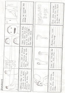
Storyboard is now available, could not be rotated on the blog


Tuesday, 19 January 2010

Expansion Upon Ideas

The main point with this production is that it is a teaser trailer and not a full blown reveal trailer. Given the current genre which I am doing, comedy, that could be a little difficult as I must give away a little but not too much.
I have had some new ideas upon how I am going to do this:

  • Opening title "two friends"
  • Shot of two people racing on a luggage trolley
  • Title "now"
  • shot of the two laughin in a bar
  • Title "enemies"
  • Shot of a third person telling them one will be fired
  • Rapid editing now used of random moments of physical comedy
  • Title Comedy factory presents: Luggage Boys
  • The final scene is undecided as of yet however an idea i had was going to have it end with the two in a face off?

These Ideas will be put into story boards and uploaded with the next post: Cast, Locations and Final Ideas

Saturday, 9 January 2010

Film Trailer Review


In order to gain a sense of what I am going to be creating I must look at existing works of comedy film trailers, I have chosen two film trailers to analyse and from that analysis use their ideas in my own production.


The first trailer I am going to analyse is Epic Movie, this film is from two fo the directors of the Scary Movie franchise and there was already predictions as to the jokes which would be featured in the film.


This trailer is a trailer of a film which is parodying many others, as this is the case most of the parts shown in the trailer are showing parts of other films which came out at the time of the films production re enacted by the cast in a comedic way. The trailer shows small clips from various parts of the film which have little to no contnuity in them, this is quite standard of a conventional trailer, however most trailers show sections of the plot which the audience are sometimes able to string together, as this film does not have any real plot to it, the trailer does not need to show any evidence of a plot. Returning to the first point about showing small sections of jokes in the film, this is standard of a comedy trailer as in order to entice an audience into watching the film, a trailer must show short snip in parts which will appeal the most, this is true for all trailers, e.g. action films will often show the most parts with explosions, or a horror film will often show the parts which lead up to a scare or the climax of a scare. This technique is applied to most trailers shown and this one is no different, I will be applying the same technique to my production, however due to time constraits it will need to be much shorter than the two minute trailer shown.


The second trailer im going to be analysing is for a recently released film, Youth in Revolt, this trailer focuses much more on the story but still reveals some of the jokes which will be told during the film.

This film trailer uses the more similar format to which I plan to make mine in, it uses a more story based narrative as opposed to the random jokes of Epic Movie. My film trailer will use the same style which this one uses, this trailer tells the audience the basic but key points of the story, e.g. boy, not man enough, creates destructive persona, hilarity ensues, romance is a secondary objective by the director. Those key points in the story, coupled with a few comedic actions by the main characters are what attracts the audience into watching the film.
Another plus point which i find useful about this trailer is the background music involved, it shifts midway through the trailer to a completely different song (Bon Jovi-You give love a bad name) this is done out of necessity as the film needs to establish the characters feelings but in a more comedic way than a traditional love song about having ones heart broken.

Both of these trailers are good examples of comedy trailers and I will be using the same ideas which they have shown me to make my trailer an attractive, funny piece of media e.g. Use small quick jokes and gags, establish a basic plot line for people to follow, use background music effectivly and change when appropriate or for comedic purposes.